Understanding Your Dashboard
Your dashboard answers the questions a coach would ask, in priority order: Can you train hard today? Are you training enough? Are you improving? Where specifically?
Last updated: Jun 2026
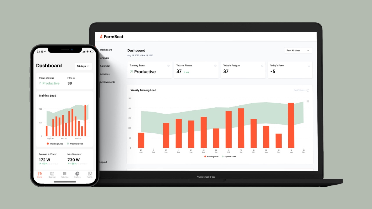
When a coach looks at an athlete's training, they don't start with individual workouts. They ask questions — in a specific order. Your dashboard is organized around those same questions, so you always know where to look and what it means.
⚡ Can I train hard today?
The four cards at the top of your dashboard give you the answer at a glance.
Training Status is the simplest possible answer — one word:
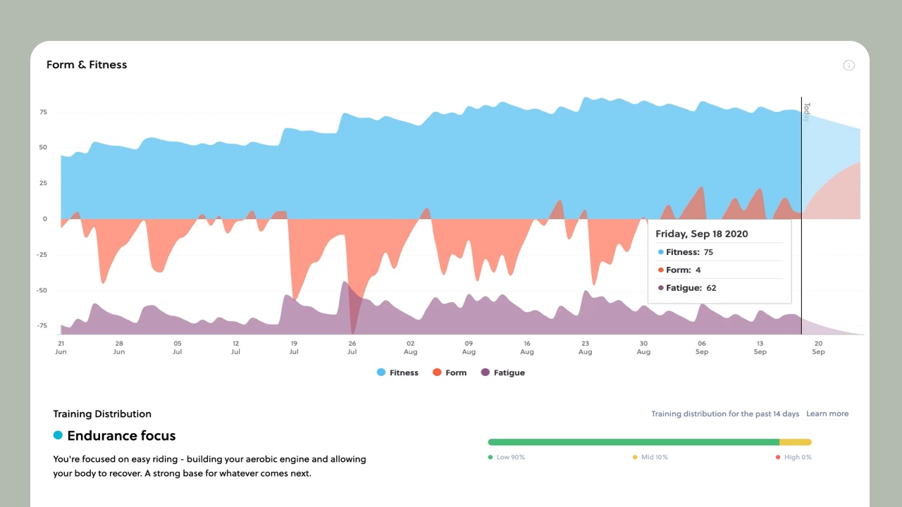
Fitness (CTL) reflects your training over the past several weeks. It rises gradually with consistent training and falls slowly when you rest. Think of it as your training bank account — built up over time through regular deposits. The arrow shows which direction it's trending.
Fatigue (ATL) captures what you've done recently — roughly the past week. Unlike fitness, it moves fast. A big weekend spikes it. A few easy days bring it back down. High fatigue after hard training is expected — the question is whether you're recovering from it.
Form (TSB) is fitness minus fatigue. Positive form means you're fresh — your fitness is there, but fatigue isn't masking it. Negative form means you're carrying tiredness. That's normal during a training block, but not where you want to be on race day. Many athletes race well with form somewhere in the positive range, but the exact number that works best is personal — pay attention to how you feel and perform at different form values to learn your own pattern.
Below these cards, the Form & Fitness chart shows how these numbers have moved over the past weeks and where they're heading. The prediction line extends about two weeks into the future based on your recent training patterns — use it to plan for events. You want to arrive with good fitness and positive form.
The quick read: if Status says Productive and Form is positive, you're in a great spot.
⚖️ Am I training enough?
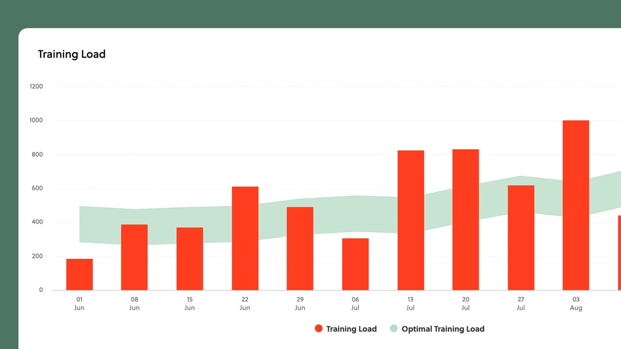
Two sections answer this together: your training load and your training distribution.
The Weekly Training Load chart shows something most apps don't: a shaded band representing a suggested training range, calculated from your personal history. It reflects the load your body has been handling and gives you a reference point — not a hard rule. Stay roughly within this band and you're likely building fitness sustainably. Drop well below it for extended periods and you risk losing what you've built. Push above it for too long and you may accumulate more fatigue than you can absorb. Use it as a guide alongside how you actually feel — things like sleep, stress, and nutrition matter too.
Training Distribution shows how your effort is spread across intensity zones, alongside your Polarization Index. Studies of elite endurance athletes have observed that many tend to spend roughly 80% of their training time at low intensity, with most of the remainder at high intensity — relatively little in the moderate "tempo" zone. The Polarization Index reflects this pattern: higher values mean a clearer separation between easy and hard efforts.
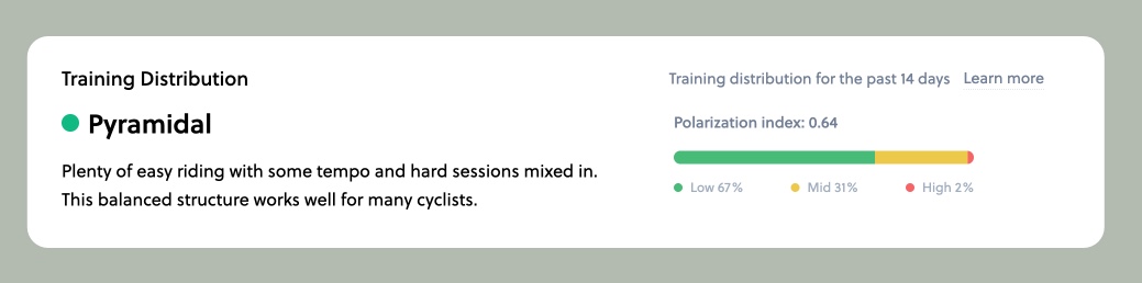
This isn't a universal rule — tempo work has its place, and optimal distribution varies by discipline, training phase, and individual. But the metric helps you see whether your easy days are genuinely easy and your hard days are genuinely hard, or whether most of your riding lands in an ambiguous middle ground.
Together, these answer: are you doing the right amount and the right mix?
📈 Is my training working?
Four things on your dashboard answer this question.
First, your Fitness (CTL) trend line. Is it going up over weeks and months? That's your clearest signal. A rising fitness trend means your training is working.
Second, your Aerobic Efficiency. This tracks your Efficiency Factor (Normalized Power / Average Heart Rate) across qualifying Zone 2 rides over 6 months. A rising trend means your cardiovascular system is becoming more efficient — you're producing more power per heartbeat. This is one of the most reliable indicators that base training is working, often showing progress before raw power numbers move.
Third, your Power Curve. Compare your current curve to your all-time bests. If the gap is closing — if your recent performances are approaching or exceeding what you've done before — you're getting faster. If the current curve sits well below your all-time curve, there's room to grow.
Fourth, your Training Distribution. A clear separation between easy and hard efforts — with enough of each — suggests your training structure supports adaptation. If most of your time is stuck in the moderate zone, you may not be recovering enough on easy days or pushing enough on hard ones.
💪 Where am I strongest — and where can I grow?
The power section of your dashboard breaks down exactly where your strengths and improvements are.
The Power Curve shows your best power at every duration — from 5-second sprints to hour-long efforts. The shape of this curve reveals what kind of rider you are. A steep drop from short to long durations suggests neuromuscular strength. A flat section around 20-60 minutes indicates strong threshold capability. Comparing your current curve to your all-time bests shows exactly where you're peaking and where there's room to grow.
Your Athlete Profile compares your power across four key durations — sprint, anaerobic, VO2max, and threshold — to reveal what kind of rider you are. At a glance, you can see your strengths, your growth opportunities, and what kind of events suit you best.
Power peaks show where you're setting records at key durations. Even small improvements — 5 watts here, 10 watts there — add up over a season. These tell you which energy systems are responding to your training.
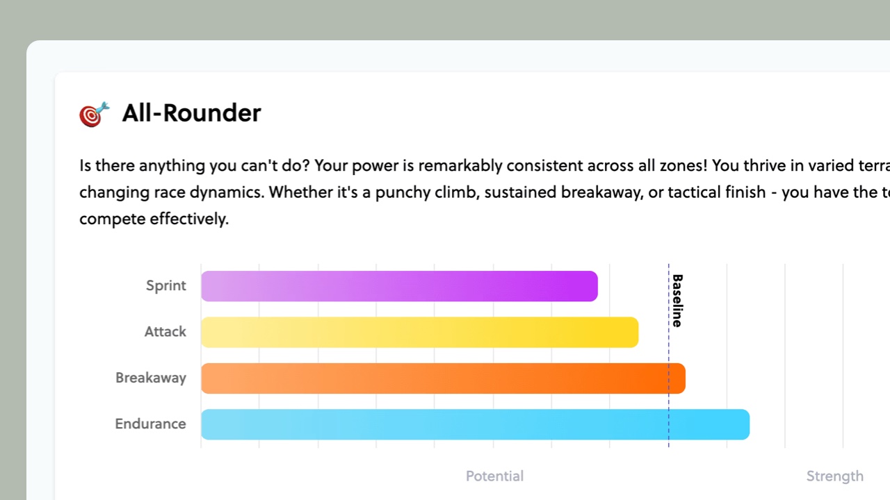
Your Athlete Profile ties it all together — it compares your power across these key durations to highlight your strengths and surface the areas where targeted work could make the biggest difference.
☕ Your daily check-in routine
Open dashboard. Check the four cards at the top. Glance at training load. Done. That's your 30-second daily check. Go deeper once a week — look at power trends, review distribution, check if your fitness line is heading where you want it to go.